The Anchor Component: Navigating Your Website or Application
The Anchor component is a fundamental element for linking between pages, sections, or resources, enabling users to access additional content or perform actions.
Features
Discover the key features of the Anchor component.
Customizable Styles
Tailor anchor links to match your brand seamlessly. Choose from a range of customizable options including colors, typography, and hover effects, ensuring your links blend harmoniously with your design system.
Accessible Navigation
Ensure inclusivity with anchor links optimized for screen readers. Implement ARIA attributes and semantic HTML structure to provide clear navigation cues, enhancing accessibility for all users regardless of their abilities.
Responsive Behavior
Anchor links adapt gracefully to various screen sizes. Utilize responsive design principles to ensure that anchor links maintain usability and readability across devices, enhancing the user experience on desktops, tablets, and smartphones alike.
Anatomy
Background
Has a background color of background-brand which serves to highlight the text and make it more visible.
Text
Comes with text-primary-inverse color which helps in distinguishing the button from other elements on the page.
Example Use Cases
Navigation Links
Use the Anchor - Button component to create navigation links that direct users to different pages within the application or external websites. It is suitable for linking to homepages, product pages, contact pages, and other sections of the website.
Call-to-Action (CTA) Buttons
Incorporate the Anchor - Button component as call-to-action buttons to encourage users to perform specific actions, such as signing up, subscribing, making a purchase, or downloading content. CTAs are typically placed prominently on web pages to attract users' attention and drive conversions.
Menu Items
Utilize the Anchor - Button component as menu items or navigation elements within dropdown menus, sidebars, or navigation bars. It provides a clickable interface for users to access different sections or features of the application.
Form Submissions
In forms and input fields, use the Anchor - Button component as submit buttons to trigger form submissions or submit user input. It allows users to submit their data or confirm their actions with a single click.
Guidelines for Usage
To ensure consistency and usability when using the Anchor - Button component, adhere to the following guidelines:
Semantic Markup: Use semantic HTML markup ( <a> tag) to create Anchor - Button components for better accessibility and SEO optimization. Ensure that the anchor element includes appropriate attributes such as href to specify the destination URL.
Visual Design: Apply consistent visual styles to the Anchor - Button component to differentiate it from regular text links and buttons. Use styling such as background color, text color, border radius, and hover effects to make the Anchor - Button visually distinct and clickable.
Accessibility: Ensure that the Anchor - Button component is accessible to users of all abilities by providing keyboard navigation support, focus states, and descriptive text or tooltips. Use ARIA attributes to enhance accessibility for screen reader users.
Responsive Design: Design the Anchor - Button component to be responsive and adaptable to different screen sizes and devices. Test its appearance and functionality across various devices, including desktops, tablets, and mobile phones, to ensure a consistent user experience.
Variants
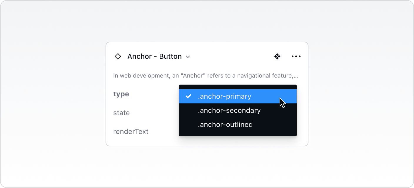
.anchor-primary
The main style for the component, often used for primary actions or the most important interactions, typically featuring bold colors and a solid background to stand out.
.anchor-secondary
A less prominent style for the component, used for secondary actions or supplementary interactions, often with a more subdued color palette and less emphasis.
.anchor-outlined
A style featuring an outline, providing a distinct look often used for emphasis or differentiation, typically with a transparent background and a colored border.

States
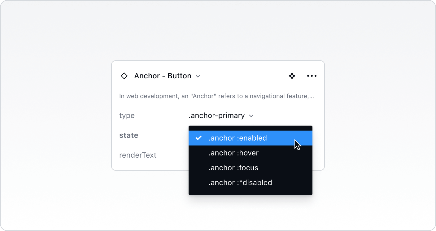
.anchor :enabled
The default state where the component is fully interactive and ready for user actions. It appears normal and invites interaction.
.anchor :hover
The state when a user places their cursor over the component, indicating it is ready for interaction and often visually changes to show responsiveness.
.anchor :focus
The state showing that the component is currently selected or active, highlighted for user awareness and accessibility purposes, often with a border or shadow.
.anchor :*disabled
The state where the component is visible but non-interactive, indicating it is not available for use. It often appears faded or greyed out to signal its inactivity.

Best Practices vs. Common Pitfalls
Do:
Ensure that the Anchor components clearly indicate their functionality and the action expected from the user.
Make sure that the component is accessible, adhering to web standards for navigational components.
Don't:
Avoid using too many Anchor buttons in a small area to prevent clutter and confusion.
Refrain from mixing different Section Anchor variants without clear demarcation, as it can disrupt the flow and structure of the content.
Avoid using inconsistent styling across different states and variants that can result in a fragmented user experience.