The Alert: Delivering Non-Intrusive Notifications
The Alert component, including the Floating Box variant, displays important messages or alerts to users in a flexible and non-disruptive manner.
Features
Discover the key features of the Alert component.
Prominent Notifications
Alert - Floating Box delivers prominent notifications, ensuring user attention with its eye-catching floating design. Whether displaying important updates or urgent messages, this alert style guarantees visibility and engagement.
Dynamic Display
Displays alerts as floating boxes for enhanced visibility and engagement. The floating design dynamically positions alerts on the screen, ensuring they remain visible without obstructing essential content. Users can easily notice and respond to important notifications, improving overall user experience.
Customizable Design
Tailor alert box styles to match interface seamlessly, ensuring consistency and alignment with your brand's visual identity. Customize alert box components to suit different design themes or preferences, enhancing overall interface appeal and user experience while maintaining a cohesive design language.
Anatomy
Box Container
Holds the entire alert content and defines its appearance.
Icon
A visual representation of the alert type, giving a quick hint to the nature of the alert.
Message Area
Contains the main message or information the alert is conveying.
Close Button (optional)
Allows users to manually dismiss the alert if needed.
Example Use Cases
Error Messages
Displaying error messages or validation feedback when users submit forms or interact with input fields incorrectly.
Success Notifications
Providing confirmation messages to users after they successfully complete an action, such as submitting a form, saving settings, or completing a purchase.
Warning Alerts
Alerting users to potential issues, changes, or system updates that may impact their experience or require their attention.
Informational Messages
Communicating important information, tips, or instructions to users without interrupting their workflow.
Guidelines for Usage
To effectively utilize the Alert - Floating Box component in a design system, consider the following guidelines:
Contextual Placement: Determine the appropriate context or trigger for displaying the floating box alert. This could be based on user interactions, system events, or specific content conditions.
Visibility and Duration: Ensure that the floating box alert is visible and prominent enough to capture the user's attention without being overly intrusive. Consider implementing configurable options for controlling the duration of the alert's display and allowing users to dismiss it manually.
Consistent Styling: Maintain consistency in the visual styling and branding of the floating box alerts to align with the overall design language of the product or application. Use cohesive color schemes, typography, and iconography to reinforce the brand identity and enhance recognition.
Accessibility Considerations: Ensure that the floating box alerts are accessible to users of all abilities, including those who rely on assistive technologies or keyboard navigation. Use semantic HTML elements, ARIA attributes, and proper focus management to support accessibility standards.
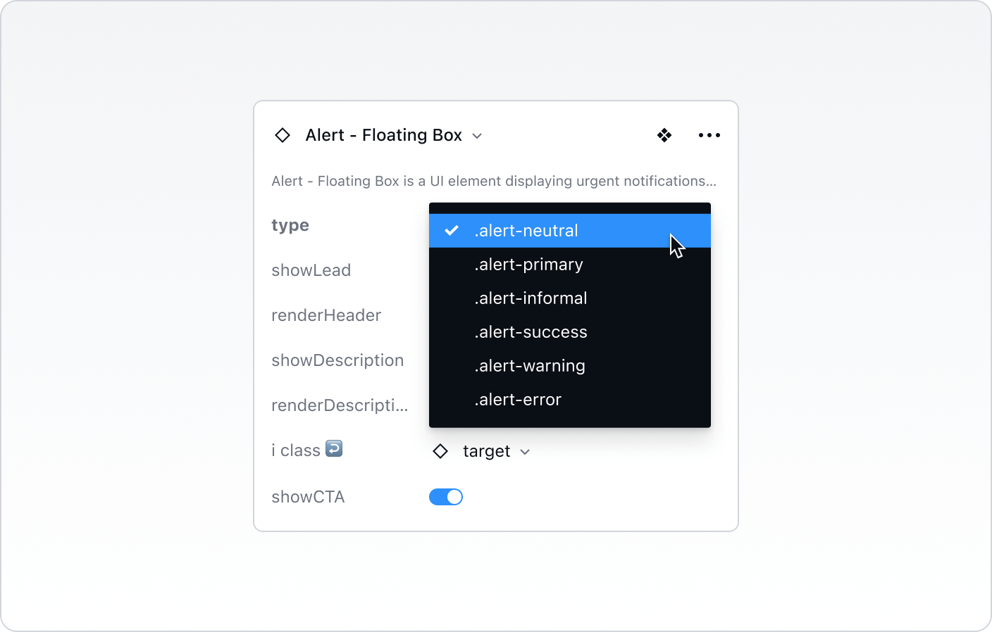
Type
.alert-neutral
The state indicating no specific action or emphasis, providing a balanced appearance without highlighting success, warning, or error. This state is used when no additional context or feedback is required, maintaining a simple and unobtrusive design.
.alert-primary
The main style for the component, often used for primary actions or the most important interactions, typically featuring bold colors and a solid background to stand out.
.alert-informal
A casual, relaxed style for the component, suitable for informal or less formal contexts, often featuring playful colors or typography to convey a laid-back tone.
.alert-success
The state indicating a successful action or positive result, often highlighted with a specific color like green or an icon like a checkmark to reinforce the success message.
.alert-warning
The state indicating caution or the need for attention, often using colors like yellow or orange and icons like an exclamation mark to alert the user of potential issues.
.alert-error
The state indicating a problem or error, usually highlighted with specific colors like red and icons such as an error symbol to signal an issue that needs resolution.

Best Practices vs. Common Pitfalls
Do:
Make sure the alert is noticeable but not obstructive to the main user journey.
Use the appropriate alert type to match the importance and nature of the message.
Ensure that the text is concise, clear, and user-friendly.
Don't:
Overwhelm the user with too many alerts. Group similar notifications or reduce the frequency.
Use an error alert for minor issues or a success alert for trivial actions.
Place the alert in areas where it might cover essential information or user controls.