The Accordion: Organizing Content in Collapsible Panels
The Accordion component allows users to expand and collapse content sections, presenting large amounts of information in a structured and space-efficient manner.
Features
Discover the key features of the Accordion component.
Compact Content Display
Accordion condenses content, optimizing screen space for efficiency while providing an organized structure for presenting information. This ensures that users can access relevant content quickly without overwhelming them with unnecessary details.
Expandable Sections
Users can expand/collapse sections for focused exploration, allowing them to control the visibility of content based on their preferences or information needs. This interactive feature promotes a streamlined user experience, enabling users to navigate through complex information hierarchies with ease.
Customizable Design
Tailor accordion styles to match interface seamlessly, offering flexibility in design customization to align with your brand's visual identity and user experience guidelines. With customizable options for colors, typography, and animations, you can create accordions that blend seamlessly into your interface while enhancing usability and visual appeal.
Anatomy
Accordion Item
Each accordion item represents a collapsible section of content. It typically comprises a header and a body. The header serves as the clickable area that toggles the visibility of the body content.
Header
The header of the accordion item contains the title or label for the section. It may also include an icon indicating the current state of the accordion (collapsed or expanded).
Body
The body of the accordion item contains the content that is revealed or hidden when the accordion is expanded or collapsed. This can include text, images, or other media.
Example Use Cases
FAQs and Help Pages
Implementing the Accordion component to display frequently asked questions (FAQs) or help topics, where each accordion panel represents a question and its corresponding answer.
Product Details
Using the Accordion component to present detailed information about products or services, with each panel containing specifications, features, or descriptions.
Tutorials and Guides
Incorporating the Accordion component into tutorial or guide interfaces to present step-by-step instructions or sections of content that users can expand or collapse based on their preferences.
Settings and Preferences
Integrating the Accordion component into settings or preferences pages of applications to organize and categorize various options or configurations into collapsible sections.
Data Filtering and Navigation
Employing the Accordion component as a navigation aid or filtering mechanism in data-heavy interfaces, where users can expand or collapse sections to refine their view of the data.
Guidelines for Usage
When using the Accordion component in designs, consider the following guidelines:
Clear Headers: Ensure that each accordion panel's header clearly indicates its purpose or content, providing users with a concise summary or title that encourages interaction.
Accessibility: Make the Accordion component accessible to users with disabilities by providing keyboard navigation support, focus indicators, and ARIA attributes to convey the accordion's state to assistive technologies.
Animation: Consider incorporating smooth transition animations when expanding or collapsing accordion panels to provide visual feedback and enhance the user experience.
Consistent Styling: Maintain consistent styling and behavior across all accordion panels to create a cohesive interface and avoid confusing users with unexpected changes in appearance or interaction.
Mobile Optimization: Optimize the Accordion component for mobile devices by ensuring that accordion panels are easy to tap or swipe, and that the interface remains responsive and usable on smaller screens.
Variants
Mode
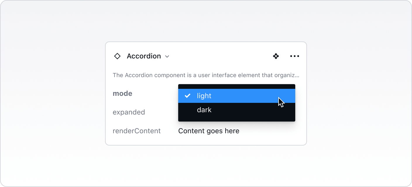
The component supports light and dark modes to align with the overall theme of the application or website.
State
Each accordion item can be in a collapsed or open state. In the collapsed state, only the header is visible, while in the open state, both the header and body are visible.
Icon Placement
The icon indicating the state of the accordion (collapsed or expanded) can be positioned on the left or right side of the header.

Best Practices vs. Common Pitfalls
Do:
Use the Accordion component to organize and present content hierarchically, improving the user experience by reducing clutter and allowing for easy navigation.
Ensure that accordion headers are descriptive and provide clear indications of the content they contain.
Provide visual feedback to users when accordion items are expanded or collapsed to indicate the state change.
Don't:
Overload accordion items with excessive content. Keep each section concise and focused to maintain usability.
Use accordions for critical content that users need to access quickly and easily. Reserve accordions for supplementary or secondary information to avoid hiding essential content.